Logos (Logo)It is an effective marketing tool that can help you attract more customers. When people search for a product or service in the market, the Logo is usually the first symbol they see. In order to make a memorable pattern, you need some of the best online generation tools.
For generating a professional logo look, it is crucial to find the top online design sites that make it easy for you to complete the task without the help of others. With some short exercises, you can even design a unique logo in a matter of minutes. All you need is a computer with an Internet connection and we will showcase some of the best online logo creation tools.
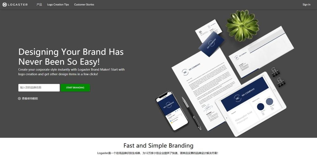
This is one of the best online logo design tools and also the most used platform to build really good designs for you. So if you want a decent logo, you might want to spend a few minutes or more on this site.
Logaster’s homepage says it all: designing a brand has never been easier, and in real time it is, the logo generator is very easy to use, offering multiple languages in which you can create logos and more, but the font selection can be limited for non-Latin alphabets. As far as we can see, you can scroll infinitely to browse more logo designs, we viewed 84 logos before stopping, but there is a button at the bottom of the page to see more.
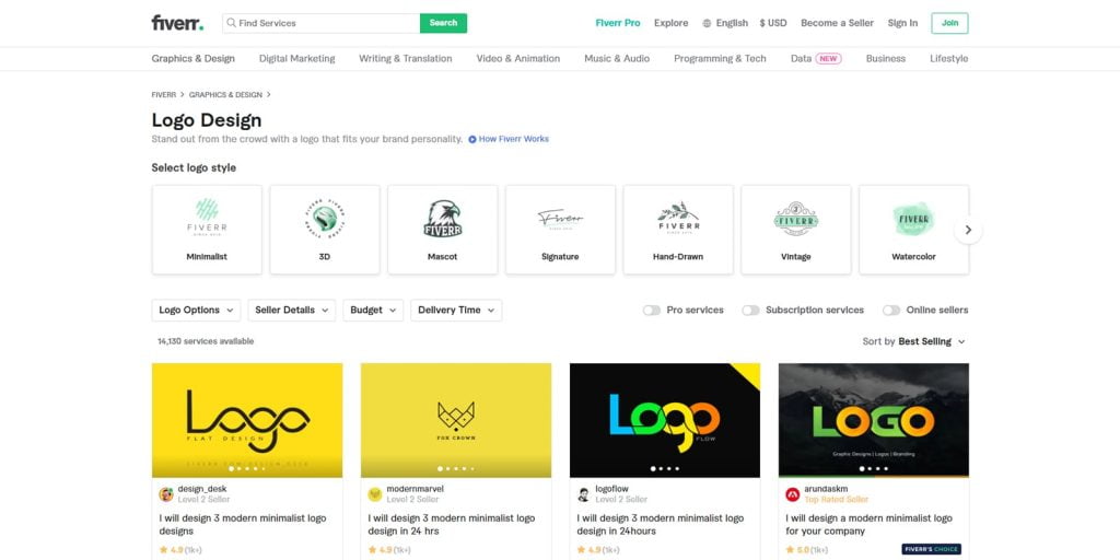
Fiverr is currently the most popular freelance marketplace where anyone can buy and sell $5 services, so if you’re not going to do it yourself, you can find many sellers offering logo design services here.
We’ve tried several different designers on Fiverr and overall, we like the way the platform works, providing a clear logo design search wizard that assists us in finding the best designer for a specific project. You can browse the designer’s profile, see their past work, and what their clients have to say about them, and the messaging system is both easy and fast.
What was really interesting was how inexpensive it was. We were skeptical about getting a logo design for only $5 and weren’t easily wowed by some of the work. But we were a little surprised when we received the final drafts from designers who don’t charge a lot for their work, andThe more expensive Fiverr ProThere is no doubt that we can safely use Fiverr in future projects.
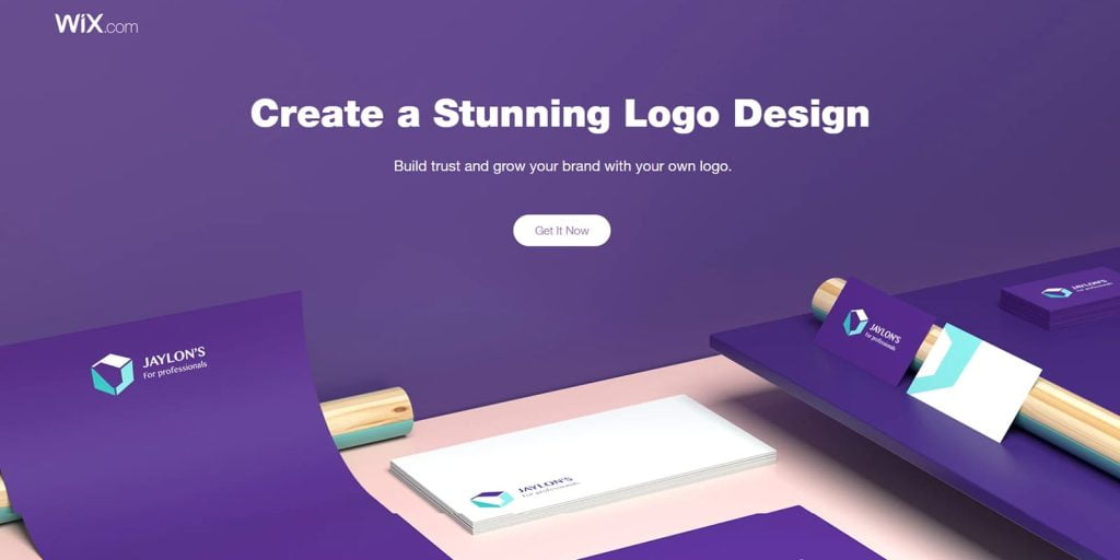
Wix Logo Maker is a DIY tool that we love. You may need a little more time to create your favorite logo, but the platform is so simple to use that you don’t need design experience to master it. You only need to answer a few basic questions to get started, and then Wix Logo Maker will generate multiple logos based on your personal preferences.
In fact, we’re not excited about any logo generated by AI, but that’s just the beginning. The logo editor gives you plenty of room for creativity, and you can decide on colors, fonts, and the placement of various materials according to your preferences. Using this tool is completely free, and you can create as many logos as you want, and you only need to pay once you are satisfied with the result.
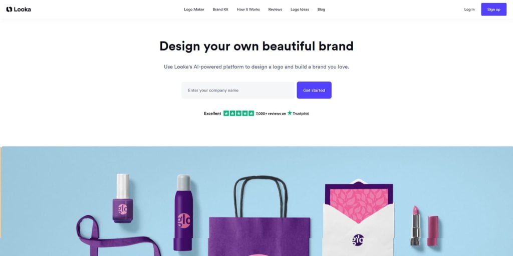
Like a real designer, Looka’s intelligent AI helps you make some key choices throughout the process before generating stunning results. Built-in tools allow you to make changes in real time and preview the latest changes. What we like most about Looka is that it generates well-designed, truly beautiful logos that may not even require extensive revisions once you choose a design you like.
What we are not so happy about is that the logo editor is very limited, for example, you can’t drag and drop elements to any position. However, as a designer, we know the reasons for this: the layout and spacing have been carefully calculated, and they don’t want the user’s choices to disrupt the original design. This way, the editor can ensure that the logo maintains a good visual appearance.
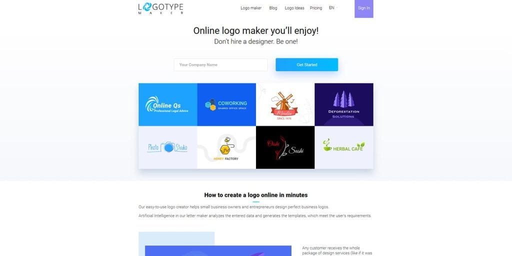
Logo Type Maker is perfect for startups and small businesses, helping you create your business logo in less than a minute and then choose any of the randomly generated results on the page. Once finished, you can add the logo to email signatures, web banners, website logos, personal business cards, office apparel, mugs, ads, social media and more, all with lifetime support and unlimited modifications with your subscription.
This platform is also easy to use, affordable, and you get almost everything that a high paying marketing agency does. However, the basic plan includes very few features, and only the premium plan allows changes to be made after the design is purchased.
Squarespace is one of the best options to get a professional website quickly, and their logo maker is also very good, very easy to use, without too many settings and features to figure out.
This is a great option if you just need a quickly generated logo for personal use, however, if you need it for business use or are looking for a more professional, unique design that really stands out, Squarespace may not be a good fit. You do not have to sign up for an account to use the logo generator, however, if you are already a Squarespace user, you can easily integrate the new logo into an existing website.

Shopify is the world’s best eCommerce site builder, serving over 1 million sellers. They also offer an online logo design feature that can help you create unique logos in minutes. With just 4-5 clicks, you can make a bunch of templates with a well-designed interface perfect for beginners.

Suitable for beginners and professionals alike, Canva is a powerful and versatile software that helps you design any image, including Facebook ads, infographics, page layouts, and a wide variety of logos. Choose your website type and the right logo design, then customize the font to make it more attractive. Logos are available for download in PNG, JPG, and PDF formats.
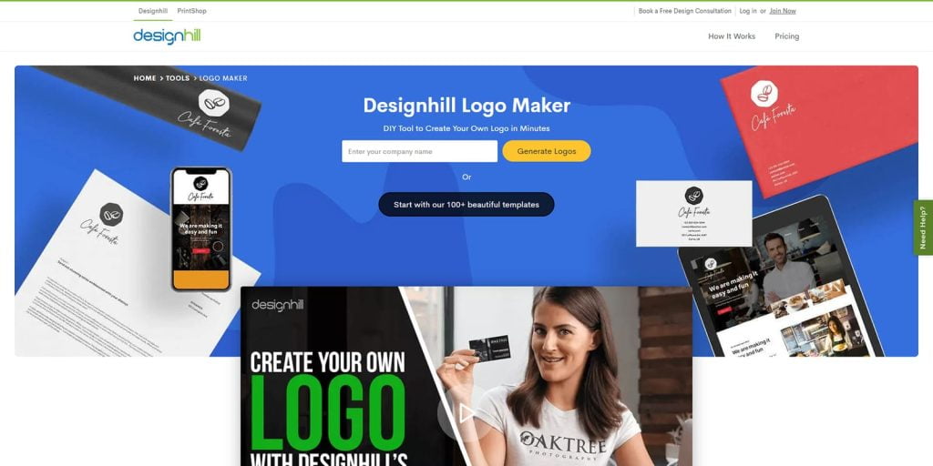
Designhill has over 1,000 logo designs, and you can choose colors, fonts and text to match any scheme based on specific needs. It’s a leading global crowdsourcing platform with thousands of business owners and graphic designers active every day. In addition to designing logos, you can also start a contest for more professional results — often dozens of design teams will respond to a contest you launch, which allows you to choose from a large number of options.
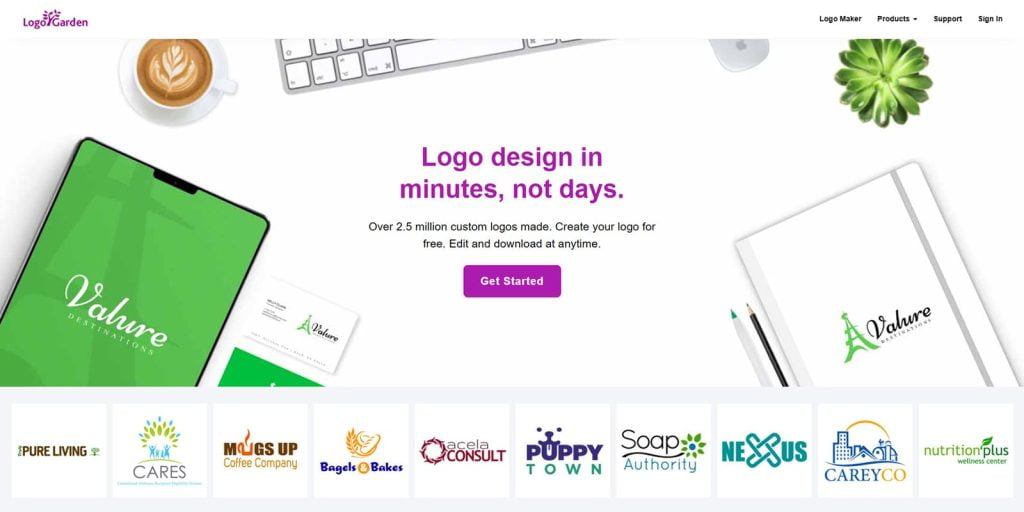
LogoGarden is a free logo creation website that allows you to design original logos in a matter of minutes. Founded in 2011, this tool initially focused on providing hundreds of samples from the accounting industry to transportation, and over the years, they now have thousands of branding symbols and layout options that allow you to easily design logos for personal business cards, online websites, t-shirts, coffee mugsSmartphoneLogos on products such as
More focused on quality than quantity, Logoworks offers an easy-to-use online logo design platform that allows you to craft a satisfying logo.
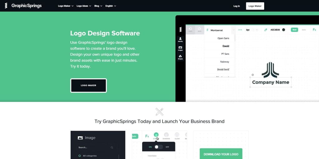
If you want to create a good logo in a minute or less, use the perfect online creation tool – GraphicSprings, which can help you design a good logo quickly and provide it in JPG, PNG, PDF, SVG and other downloadable formats.
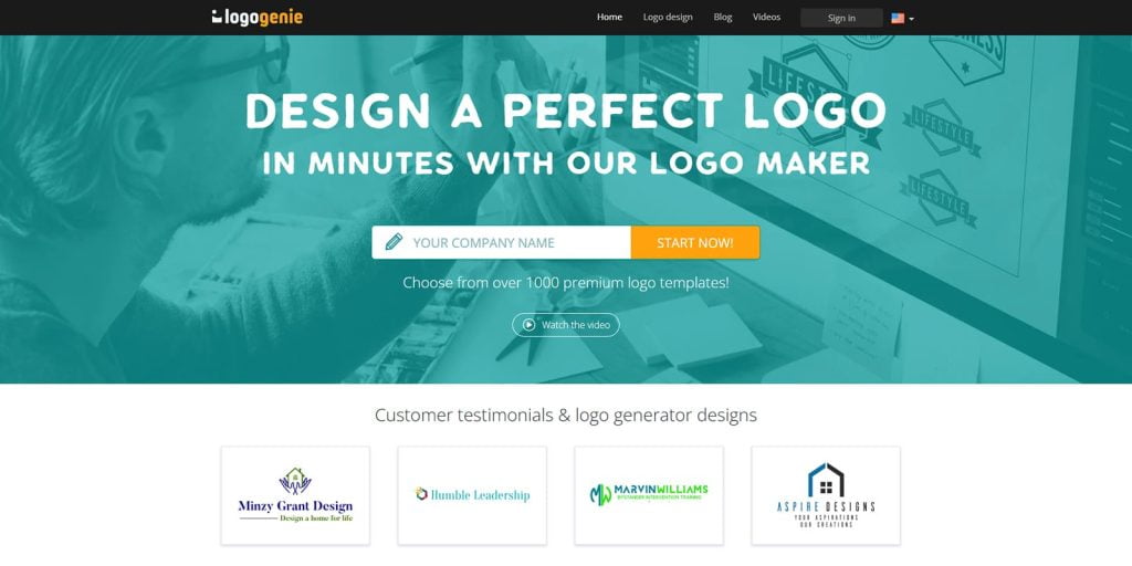
Logo Genie is a well-known creative tool that offers an easy-to-use interface that allows you to easily bring your design ideas to life. You can even customize the colors, orientation, and some gradients, and the final files come in a variety of formats, including JPG, PNG, PDF, EPS, and more.
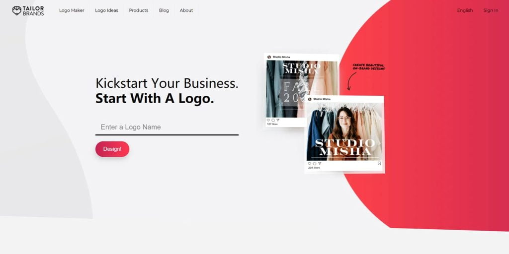
Tailor Brands is an advanced tool for creating elegant logos that will help you figure out the best visual style for a specific business. Enter the company name and add some relevant information. To make the creation easier, you can also choose the type of logo (based on icon, name or initials) and after choosing the font, you will get some preliminary draft designs.
Ucraft has a super simple interface and unlimited use, adding and removing elements is easier than usual, and you can download high-resolution logo files for free.
How to Design a Logo: 30 Pro Tips
One of the biggest design misconceptions is that making a logo is easy. First of all, it’s not just a simple combination of colors, fonts and graphics put together, it’s an important part of a brand’s visual identity. Creating a logo requires critical thinking, creative input and methodical planning – in short, you can’t create a logo while swiping through your WeChat friends.
To help you design an impressive logo, we’ve compiled a portfolio of 30 effective rules and tips.
1. Get inspired
Inspiration for creativity can come from anywhere. The most obvious source of inspiration when creating a logo is a design-centric website, then expand your research to other creative sites or look at your surroundings; anything that makes you mad or happy is a potential source of a classic idea.
2. Learn all about the logo
An effective logo should be unique, smart, visually appealing, and provide a specific message, and no matter how complex and time-consuming the design process, the final product must always be easy to understand and memorable.
3. Develop your own creative process
Each designer has their own approach and it will hardly ever be linear, however, most of them follow a general production process that includes
- Design Brief: Visit the customer and make sure you get all the information you need
- Research: learn more about industry knowledge, customer history and the level of competition
- Reference: View design inspiration related to client needs and research current design trends
- Conceptualization: drawing and developing the logo based on the given abstract and the research done
- Iteration: After a quick design, take a moment to let the idea mature
- Demonstration: Select some design options to present to the client, get feedback and refine until the design is complete
4. set their own price system
How much does this design cost?
Arguably this is one of the most common questions and a difficult one to answer because every client has different needs. You need to learn business skills – especially if you are a freelancer. Designing a logo can involve different factors, including the number of concepts that need to be presented, the number of revisions, the depth of research, etc.
The best way to handle this business is to draft a custom quote for each client, and in the process, you will learn how to bring business value to yourself.
5. Learn from others
Learning from those top brands will give you insight into the entire brand production. In a way, this awareness can help you improve your work.
6. research your audience
Designing a logo is not only about creating appealing visuals, your main goal is to build a brand, but also to create a bridge between your company and its audience. That’s why market research is so important, make sure you are clear on this information before you start the creative process.
7. Commitment to the brand
Before creating a logo sketch, take some time to learn about the client: who they are, what they do, how they work, and what their goals are. Study their previous version of the logo (if any) and consider the upgrades needed to fully represent the brand. Then, list the key points and considerations about the client’s needs before proceeding with the design.
8. Save all sketches
It is common practice for designers to provide a few sketches for individual projects, and even if you are able to identify sketches that need to be developed early on, don’t discard other versions as they may be a valuable resource in the future. Just because sketches don’t work for one client doesn’t mean another doesn’t like them. You can revisit them whenever a new project requires seeds of inspiration.
9. Online Research
If you’re struggling with an idea or concept, look up keywords related to your brand online or search for images for visual inspiration.
10. create mind maps
This tool helps to filter the ideas in your mind. Mix various images and concepts, use keyword alternatives, accumulate various inspirations through different sources, put them on a giant mind map and see how they can work together.
11. Demand Segmentation
This relates to the tips above, first making mind maps related to the project, evaluating what makes them effective, and later breaking them down step by step until a unique piece is designed.
12. Preventing clichés
Every two years or so, a whole new design fad enters the field, and you can draw on some of those styles — but if the new ideas are basically just throwbacks to old styles, don’t chase the trend.
13. Make the design flexible and versatile
Creating a versatile logo goes a long way in ensuring longevity. If it looks good on a poster, but terrible on a novelty item, it may limit its popularity. Versatility plays a huge role in the choice of design elements (colors, fonts, layout, etc.).
14. Using the grid to produce timeless designs
When it comes to design (especially using traditional techniques), it’s all about the grid.
15. Use of pens and paper
Even though many sketching programs are already available on the Internet, sketching with pen and paper is still the best way to implement ideas. It doesn’t matter if your sketching skills are poor, as long as they convey your ideas correctly, you’ll be on the right track.
16. Build the carrier
Once you’ve sketched out your ideas, move on to a more technical design. Adobe Illustrator is your best friend in this process, allowing you to retool the design without sacrificing quality.
17. Carefully decide the font
Print fonts are a key element in making effective logos, and there are generally two main options: use a custom or preset font. If you plan to create new fonts, it’s best not to get too trendy.
18. Stay away from gimmicky fonts
Avoid gimmicky fonts to give logos a sparkling allure; most fancy fonts look too polished. If your goal is a professional and unique look, avoid this typeface at all costs.
19. Use up to two fonts
Of course, there are exceptions to this rule, but as a common principle, if you want your design to be unique, sharp and clean, it is wise to use only two fonts.
20. Tell a story
Every design has a story to tell, and logos are no exception. You can’t convey the meaning behind a logo if you only see it as a structure of lines and text. Ideally, a strong logo has two stories: one that is obvious, and another that is hidden deep within.
21. Consider the surrounding blank area
Most brands need an exclusion zone, a space that protects the integrity of the logo. When designing, consider how the exclusion zone should be used.
22. design an active logo
If you want to promote logo activity, consider adding some movement, not about animation, but more about the size, position and rotation of the parts. For example, when a fish is caught in a jump, it should appear in the motion scene. Also, you have to consider the direction of the expected movement.
23. Consider colors and shades
Whether you use black, white, or color, an effective logo will display well.
24. Follow the trend
Paying attention to current design trends doesn’t mean you have to follow them, and sometimes you have to break some rules to expand your design horizons — or even start a whole new design trend.
25. always practicing
If you can’t remember any of the tips presented above, then follow and enforce this rule.
26. underestimate the importance of the right color scheme
Color constitutes the essence of any visual art, and many times designers ignore the value of using color precisely, which can be caused by their misunderstanding of the meaning of simplicity and involving only white.
27. Fall into the trap of flashy ideas
Innovation is an amazing thing, and most of the time you have to try to solve problems and come up with killer ideas for your own designs. However, everything has inherent rules and constraints, and you may have a myriad of innovative ideas, but the practical uses are not. Over-experimentation can produce a cute logo or it can lead to an unrecognizable brand itself.
28. low estimate custom printing fonts
When it comes to logo design, your fonts have to stand out. Custom hand-drawn fonts are more effective than most of the cool fonts available online, plus custom fonts are more easily recognizable.
29. Unexpected
If your design looks the same as what’s already there, it won’t stand out. You need to design a logo that is somewhat unfamiliar but still relevant, and it should evoke a thought: a story, a feeling, or an action.
30. make sure your design is unparalleled
Despite confidence in your abilities, placing yourself in the best category may hinder your growth. The final design should be as good as the previous, most brilliant version, and if you keep this in mind, you will be a much better designer.
How to design a great logo
Designing great logos requires a combination of sophisticated skills, creative theory, and clever application. Any professional designer can create a unique logo for a specific purpose, but it takes a lot of time to truly master all aspects of this art.
Of course, logo design is only a small part of branding, but it is still a core component of most branding programs. We’ve listed some professional design tips that can help you improve your branding efforts – from the research phase, through the various aspects of logo design, and finally, the application of the logo.
1. Know your competitors
Before developing a concept for a logo design, make sure to thoroughly research your target market and the client should be able to provide some information about the competition. Comparing all logos from all competitors, this research may very well reveal some deep-rooted branding norms, and sometimes they can help you through the design process.
Remember, many of the world’s most recognizable logo designs stand out because they eschew current trends and adopt a very different way of thinking.
2. Ask the right questions
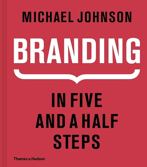
Strategy is becoming an increasingly important part of the branding process, and what this means in practice often depends on the size of the project, but it all starts with asking the right questions. michael Johnson in Branding: In Five and a Half Steps A book dedicated to the process of creating a banking business, covering a variety of complex challenges, where the details of developing a brand strategy are far more detailed than we can imagine.
Among other things, Johnson poses the following questions as a starting point for the brand.
- Why are we here?
- What do we do and how do we do it?
- What makes us different?
- Who are we here for?
- What do we value most?
- What is our personality?
3. Respect the brand’s heritage
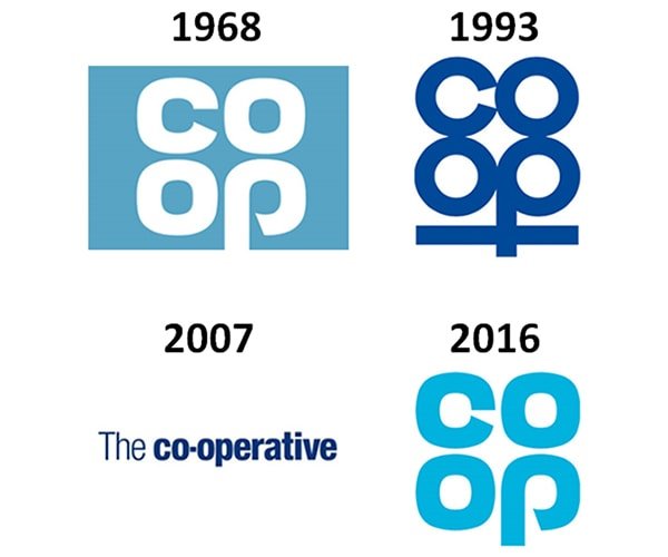
The widely popular trend is the so-called retro brand movement being acclaimed by the Co-op Pulling back the curtain, the newly designed brand revitalized their original 1960s logo and won the coveted Brand Impact Award in 2016.
While we should be wary of the retro design trend, if there is real heritage and untapped potential in a trademark, don’t bury it and please consider bringing it to the forefront. It is vital to put yourself aside rather than abandoning the creations of others, as doing so considers revolution and evolution.
4. remember: the logo is only part of the brand

People interact with brands in a variety of ways, but the logo isn’t always their first point of contact. Keep this in mind when designing your logo: stay flexible and consider how the logo interacts with the rest of the brand experience, from packaging to tone of voice.
5. Choose the font carefully
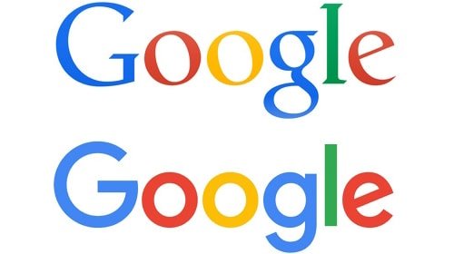
Choosing the right typeface is a critical part of logo design — in fact, many of the most recognizable brands are text logos, relying entirely on typography to convey their message.Sans SerifIn recent years has dominated logo design, often closely associated with the minimalist movement.
In 2015, Google adopted a friendlier, more modern sans-serif font for its new logo, but don’t let trends cloud your own judgment: serif fonts are still the right choice for the latest projects, especially if you need a stylish luxury or traditional professional feel, so be sure to take the time to research your options.
6. Adjustments and improvements to add personality
If you use an already existing typeface in your logo, especially one that is almost ubiquitous, it usually puts more pressure on other touch points, such as images, color palette, tone of voice, etc., to develop and enhance the brand’s personality.
Skilled tracking and spacing are important when setting up a simple logo in an existing font. A wide atmosphere allows for sophistication and authority, while tight and careful spacing locks in individual letters as separate units.
7. fully customized type
Sometimes a hand-drawn font may be more appropriate for a brand, and Coca-Cola is the most iconic example that has evolved gradually over more than a century. Compared to fierce competitor Pepsi (which has undergone at least seven major changes), they sport the same logo as the market leader in the late 19th century. If Coca-Cola had abandoned the familiar scribbled version because of Pepsi’s sans-serif font from the 1960s, there would have been an uproar.
The point is simple: getting a truly unique type of customization is the equivalent of buying yourself the powerful visibility of a long-lived brand.
8. Explore serendipitous letter combinations

Letter combinations don’t have to be restricted to wedding invitations; if handled correctly, company initials can form a simple and effective logo, especially in the fashion world.Coco Chanel (Coco – Chanel)The chain of brands C and Yves St LaurentThe dollar sign style snap lock is the most prominent example.
9. Master the entire font
If the client has an adequate budget, then you can work with Dalton Maag or Fontsmith and other professional agencies to develop a complete line of brand fonts. These two agencies have worked for Nokia, ,Lush, ,ITV We provide services for brands such as
Fonts like Univers, Arial, and Helvetica are more masculine, mechanical, and engineered than Frutiger – a humanistic sans serif typeface in an open, warm, friendly tone, where serifs can look dated or bookish.
The award-winning ITV logo has been expanded into a font that is widely adopted by this brand to ensure a consistent tone across all channels. Some of the world’s most iconic brands are still easily recognizable when you remove the company name, and they have taken ownership of a specific shape without even having to fully design the logo to be associated with the brand’s subconscious.
10. back to the original

For the best logo designs, there are a few golden rules that they always follow, first and probably most important: Simplicity. Think about your concept, but don’t over-execute it or slap a mark on it purely for that purpose. You want both ease of recognition, and versatility of scale and application.
One way to test simplicity is to keep removing elements until it reaches its most basic form, which may seem harsh. If you describe it quickly by a few rough strokes, is it still recognizable? What are its most unique defining characteristics? Generally speaking, the simpler the logo design, the easier it is to remember.
11. Mastering the grid and structure
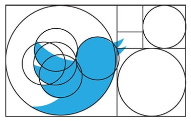
Whether using an online platform, or their own website, design agencies can publicly post versions of their sketches. Typically, these include the technical aspects of design composition, revealing and describing the raster of compositional styles, and defining the specific curves and angles of shapes.
Such projects are invaluable references that can provide useful information for your work and help develop abstract design principles, such as the active state in which the golden ratio is placed in an application.
12. Use of negative space

Smart use of the trademark inNegative SpaceIt can make people smile and use your intelligence to help with brand identity. Clever and appropriate use of negative space can also include redundant meaning in the logo design, reinforcing the theory that memorable brand identities can be produced through subtractive simplification.
13. Use wit and humor

.
Negative space is just one way to raise awareness of the smile that the late Alan FletcherOne of the pioneers in the use of simple intelligence in graphic design, this approach is particularly applicable to logo design.
If you’re passionate about introducing the wit and charm in your work, then the top people from around the world are inspirational role models for you.
14. Understanding the color wheel

The psychology of color is fascinating and plays a pivotal role in establishing brand associations. At the heart of color theory is the color wheel, a basic tool for combining colors in different ways, originally developed by Isaac Newton (Isaac Newton)Sir Robert K. K. outlined in 1666.
Here.Primary Colorsare red, yellow and blue; threeSecondary Colors(green, orange and purple) are created by mixing two primary colors; finally, six primary colors are created by mixing primary and secondary colorsThree times the color.
15. Careful management of color schemes

Many colors in logo design need to be carefully managed to be successful, and colors should not usually be used in equal amounts. If overusedComplementary colorsThe colors may be too intense, for example, they may look mild and pleasing, but lack contrast – you should choose the main color and use other colors as support.
16. using color to control emotions

The colors you choose can enhance or break up a logo design, partly for simple aesthetic reasons, but also perhaps because of the psychological connection of color. On a simple level, the warm side of color — red and yellow, for example — is uplifting and energetic, while blue and green exude a calming atmosphere and feel more reserved.
This is especially important from a branding perspective, as it relates to how consumers feel psychologically when they see it, and it also helps to stand out in the marketplace.
17. Study color trends in specific areas
Sometimes the ownership of a certain color can become a legal issue, such as Cadbury’s fight with Nestle to protect its use of the distinctive purple color
Having one color for a brand in a specific area can provide a huge competitive advantage, enabling instant recognition – in some cases without even a logo, or without mentioning the name. Of course, having a complete color is not easy; it goes beyond logo design, and all elements of branding and advertising need to be skillfully planned and executed.
In order to achieve a color-based standout in a given area, the first step is to understand what the current trends are — for example, blue is commonly used in the financial industry, while environmental organizations often use green, and sometimes it pays to avoid the obvious mistakes .
18. Don’t forget the black and white

After all the talk about color, it’s easy to forget that some of the most iconic logos are purely monochromatic and make strong use of the stark contrasts of this palette. Of course, even if your main logo design has a glossy color effect, it still needs to be presented in black and white for different scenarios.
If you are conveying meaning through color, then you need to consider how to convey that meaning when removing color. Sometimes this may mean that you need to change the contrast between different elements in order to still convey meaning in a monochromatic color palette.
19. always seek a second opinion
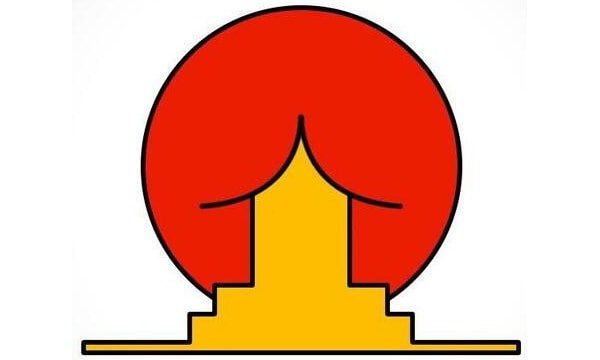
Don’t underestimate the value of a second (or third) pair of eyes to identify what you may have missed during the design phase. Once you have completed your logo design, take the time to check it for unforeseen cultural misunderstandings, innuendoes, unfortunate shapes, or hidden words and meanings.
Many design studios advocate fixing the work process on the wall for constant mutual review. If you are an independent freelancer, then try to find some trusted peers to follow your work.
20. Handling public criticism
Over the past few years, social media has become more and more popular, and everyone is generating some of their own opinions about design.
A great branding program is more than just a logo design. On some of the most active public platforms, when a new project is posted as an image, it is often the first and possibly the only visual that is directly available to the public.
A note on affiliates: Some of our stories include affiliate links to stores like Amazon, BlueHost, etc. These online stores share a small amount of revenue with us if you buy These online stores share a small amount of revenue with us if you buy something through one of these links, which helps support our work evaluating products.
